The templates were the symptom
- Role
- Sole designer and frontend engineer
- Not mine
- The automations themselves, which shipped before I looked at them
- Timeline
- Two weeks, 17 August to 1 September 2026
- Shipped
- The detail card and its full-page stage, 30 August
- In review
- PR #2907, 54 files, +3,426 / −1,025
- Stack
- React, TypeScript, Tailwind
The automation surface, before and after. Switch between them.
Both halves are the real components running here, not screenshots of them. The before is pinned to 30 August, the day before the first half of this redesign shipped. Otherwise opening a row in it would show the after.
The CEO raised one thing about the automation template gallery. Reading it, I did not think the templates were the problem on their own. Eighteen good automations sat behind a create menu where nobody would meet them, above a list that told you an automation runs At 04:00 PM, Monday through Friday · America/Los_Angeles.
The templates, as they shipped
Four of the nine names on the first screen truncate. The descriptions are scope contracts, careful sentences about what an automation will not do, printed in the one place a person needs a reason to want it. They are ordered by slug, and nothing on a card says when any of it runs.
The same job, twice. Switch between them.
The left half is the real gallery reading the real eighteen, so the truncation on screen is the truncation that shipped.
Seven of the eighteen fire on Monday morning
Not a design problem, and invisible from a gallery that prints no schedule at all: install a few of these and the week opens with a pile of AI activity nobody chose. Cadence moved to the two places where it decides something, the row once the automation is yours and the dialog that asks before anything is armed.
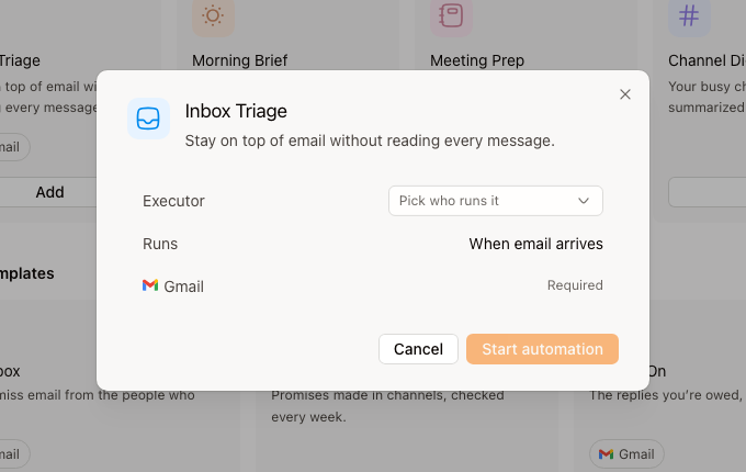
One design, two layers
Clicking an automation used to squeeze the list into a column and open a panel with no way out to a page. The peek that replaced it answers one question, whether the thing is running, and expanding adds depth rather than width. The Details card is a single component shared by both layers, so neither can be fixed without the other.
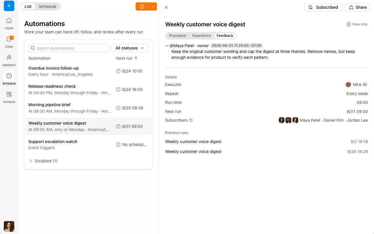
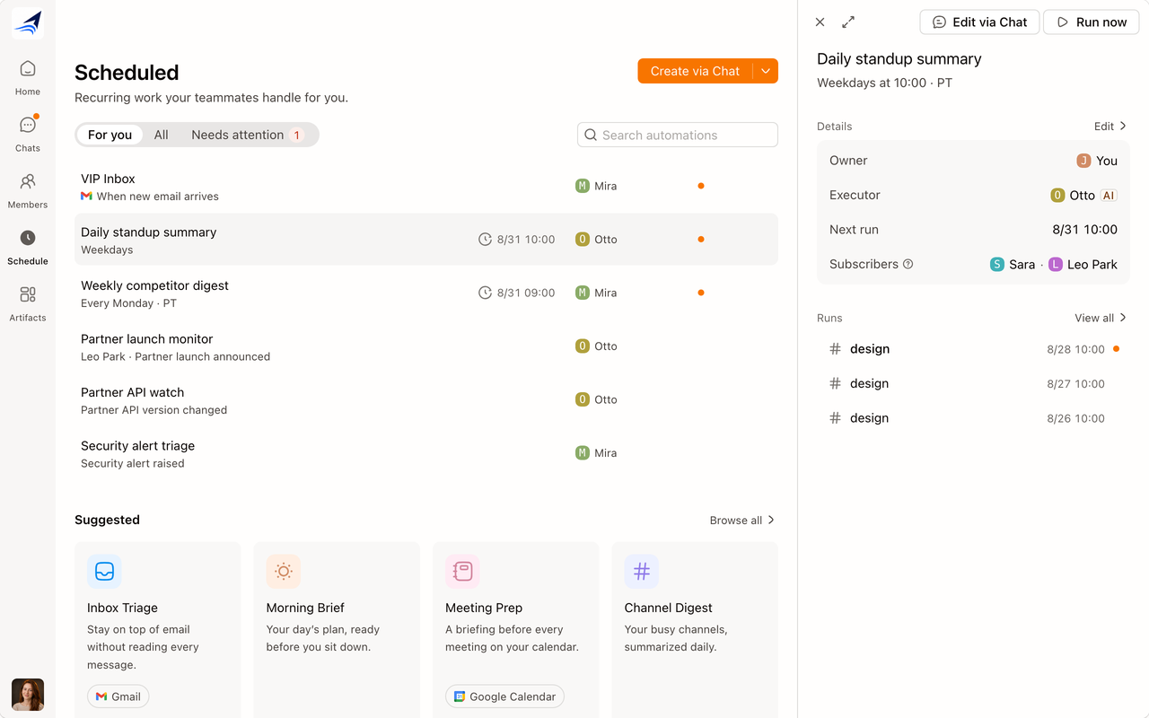
The interaction half of this shipped on 30 August as its own change; what is still in review is what the two layers say.
Real components and real mock data, running in the page. Click into it.
What the backend could actually answer
There are three kinds of trigger. A scheduled one has a next run to print. A poll or an event trigger is AI-written script underneath, with no fields a form could edit, so the page states what the trigger is and hands changes to chat instead of drawing an editable form over code that will not take one.
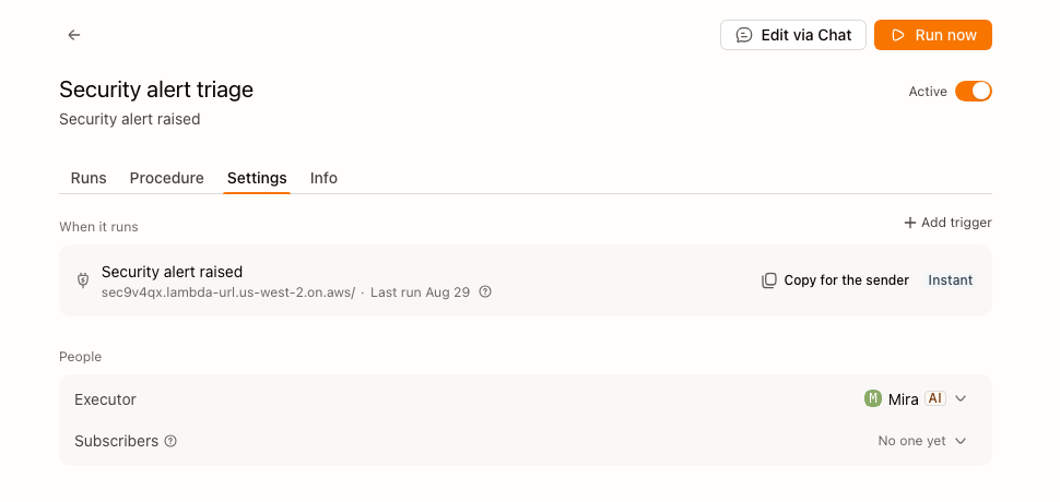
Two peeks, because two people
Next run says Waiting for trigger for the same reason it says a time elsewhere: it prints what is known. And a viewer gets a different panel from an owner, because a viewer who is offered Edit has been told something untrue.
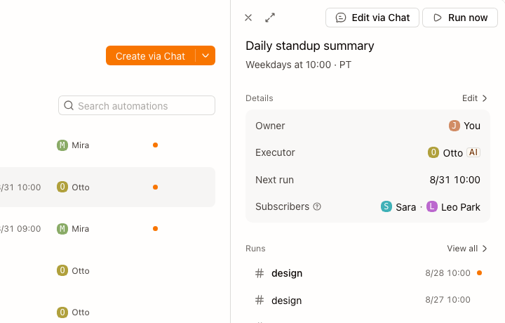
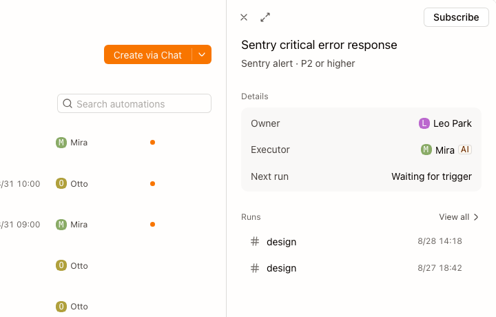
The same crop of the same component. Only what it offers changes.
Where the design changed its mind
Two of them carry the story. The first version was a template gallery; the review said the gallery was the wrong first screen, and the rebuild after it said cards were the wrong shape for something you manage rather than shop for.
- c3bebd9automation template gallery redesign proposal page
- 00e2139cards drop times, connections become provider pills, schedule is a pickreversed
- ba106a1post-review rebuild — nine templates, first-screen shelf, slim dialog, Town-style listrebuilt
- 6102498list-first Scheduled home on real automation rowsreversed
- 0e7b69aScheduled detail follows the Town reading
- f7b2dcapeek-to-page expand for the automation detail
- a9d799aconfig facts read as grouped cards
- 0b75b87the Details card, Edit included, is one shared piece
- 5018a6drebuild event triggers on what the backend can answerconstraint
- bee21c7describing a trigger leads, building one follows
- a2fdecaa viewer is not told they can edit
- 2209a82a run lands where its procedure said it would
What is still open
I built both detail models: the overlay peek, and a card dock where the list compresses instead of being covered. Which one ships depends on a decision about Home that has not been made, and I would rather it were made before this merges than have Automation become the one surface that does it differently.