Rebuilding onboarding for a product that changed underneath it
- Role
- Sole designer and frontend engineer
- Working with
- The CEO directly; backend by another engineer
- Timeline
- About two weeks
- Stack
- React, TypeScript, Tailwind, nine locales
Real components and real mock data, running in the page. Click into it.
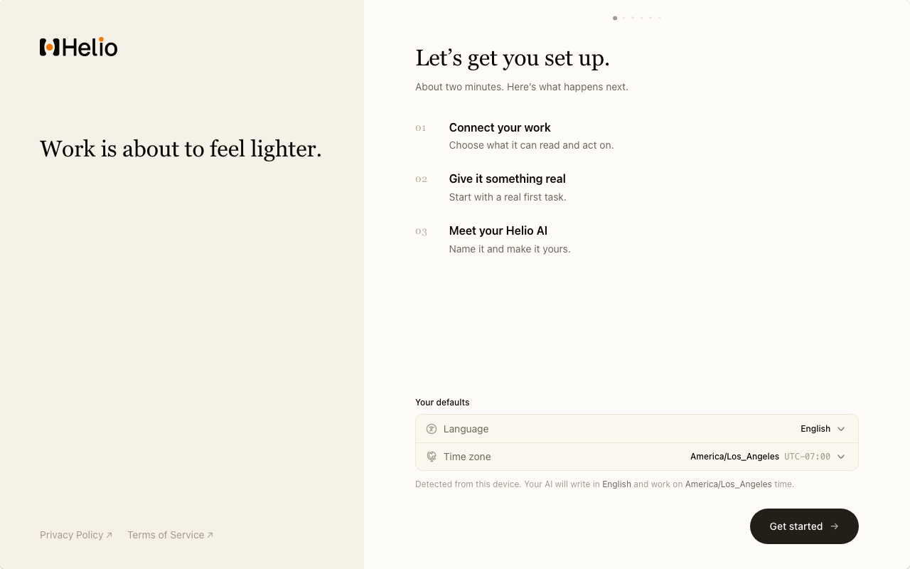
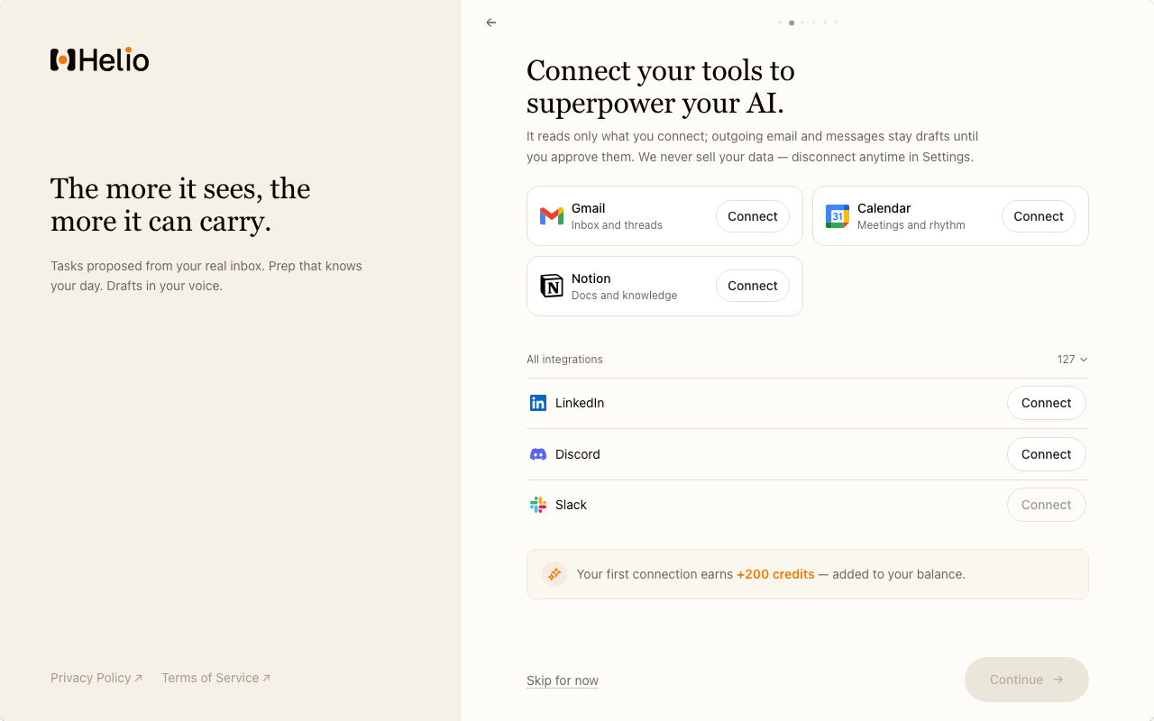
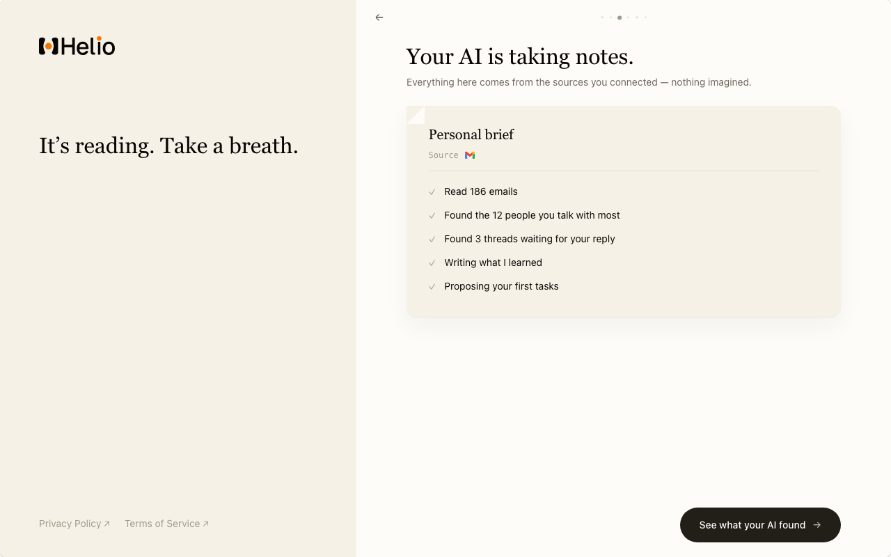
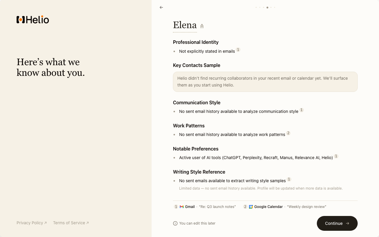
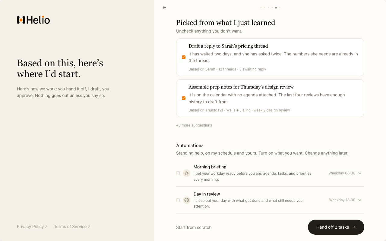
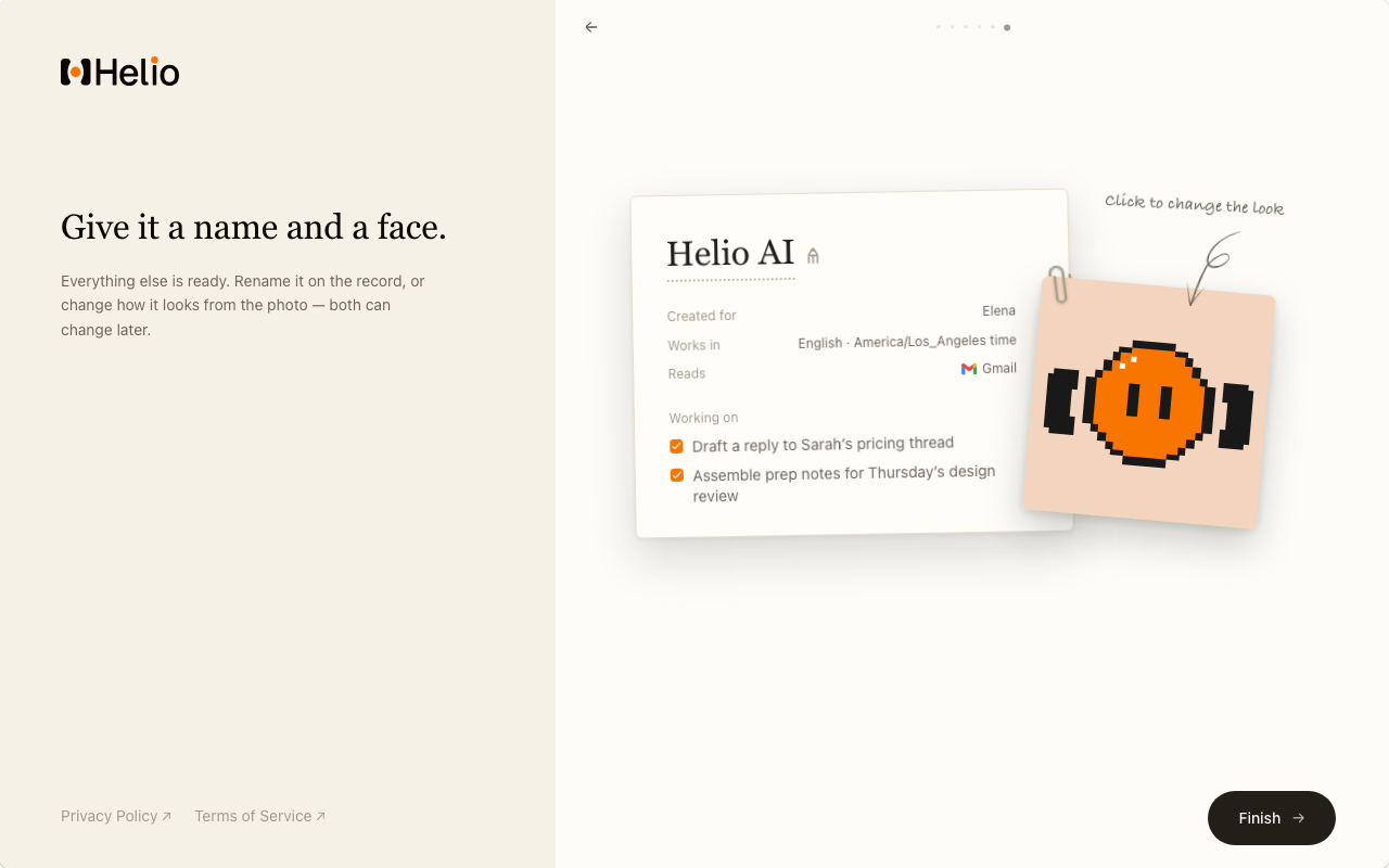
The whole arc. Click any frame for the full size.
What it replaced
Both flows, running. Switch between them.
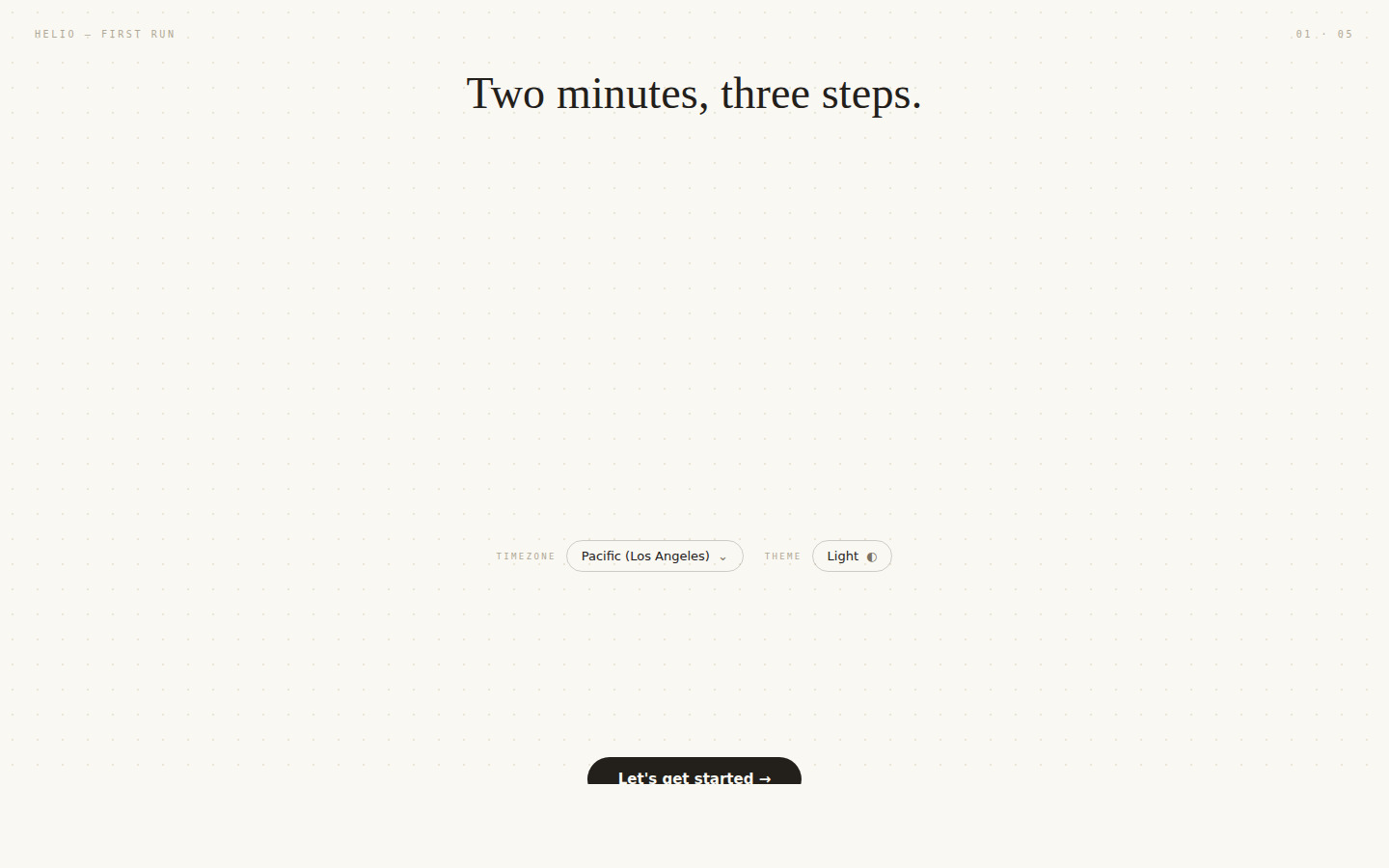
Same first screen, two products. Each one is the real interface, so you can walk either.
In 0.6 the product changed underneath the flow. Instead of managing a team of AI teammates, each user would have one personal AI. Theirs alone.
The old onboarding, built by a colleague for the previous product, could not absorb that. It asked people to pick several teammates before they knew what one could do. It requested inbox permissions in the same breath as promising we never send on your behalf. And it contradicted itself: two screens after telling you "One assistant. Yours alone." it asked you to meet the team and pick two.
Context, and what it buys
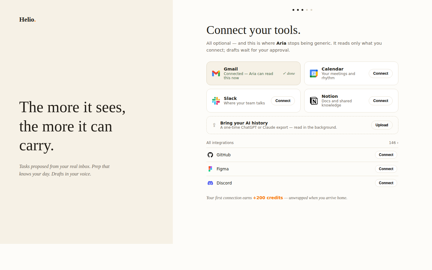
The flow says its own thesis out loud, on the left of the second screen: the more it sees, the more it can carry.
Everything in it is either collecting context or spending it. Connecting collects, the scan reads, and the report is proof the reading happened. The tasks at the end are the spending, and they are the only part anyone actually judges.
A task assembled from a template can only be about your job in general. One assembled from your inbox is about the particular week you are in. Only the second is worth the two minutes the flow just took, so the whole order exists to make it possible.
Connecting comes first because the scan needs a head start
Customizing first is the warmer order. Connecting first means the scan is already running in the background while you meet your AI, so the wait has something in it.
The first connection pays, because its value arrives later than its cost
Handing over your inbox is a cost you feel immediately, for a benefit you cannot see yet. The credits are the part of that trade the user can evaluate on the spot. It sits at the bottom of the screen below, under the 127 integrations.
Real components and real mock data, running in the page. Click into it.
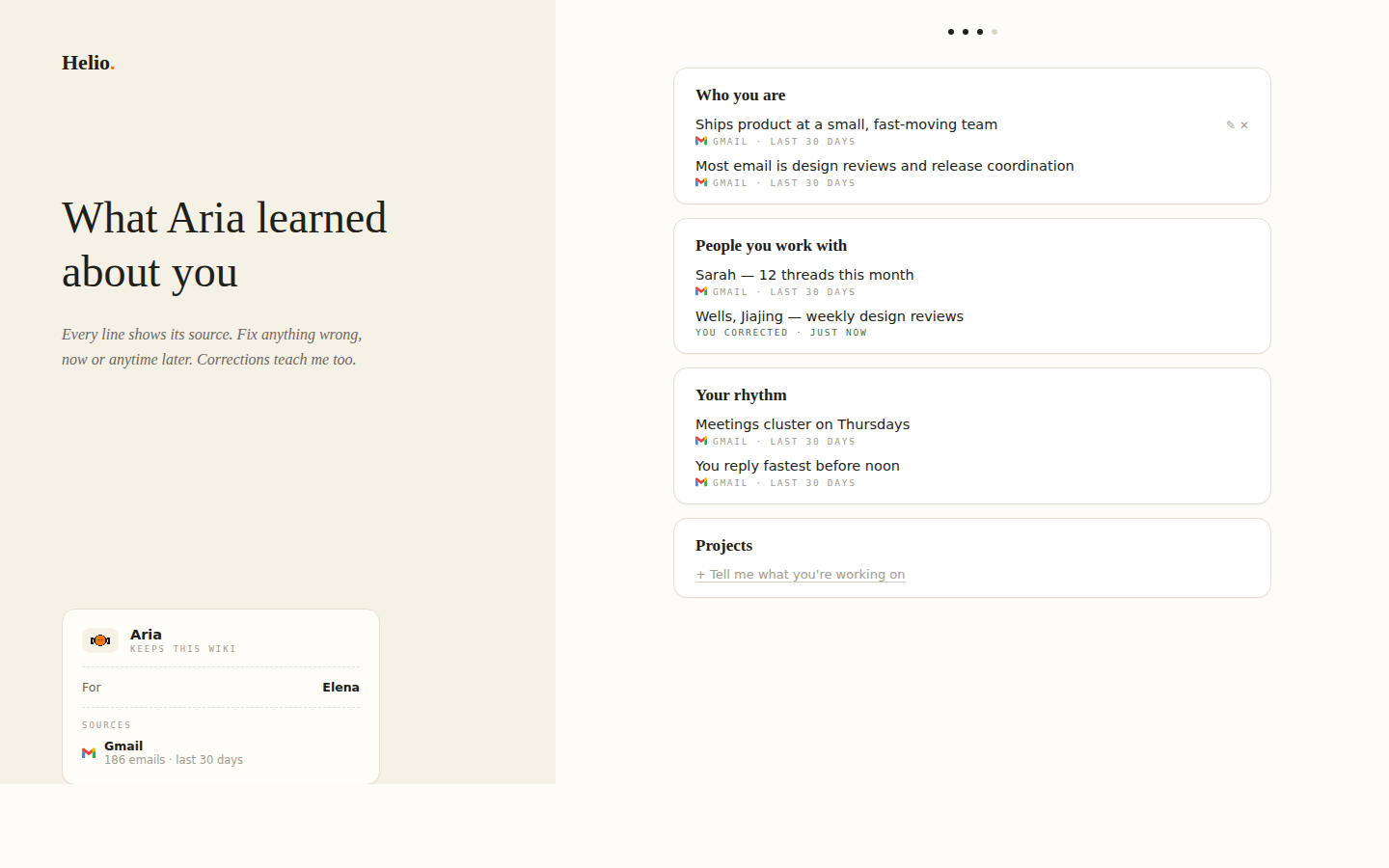
Every proposed task names where it came from
Each task carries a Based on line listing the sources it was built from. That line is the reason the tasks are generated rather than templated: a template has nothing to put in it. When nothing is connected the flow does not fake the line. It drops to a single automation, and on that path picking one is required, because choosing it yourself is what makes it yours.
Real components and real mock data, running in the page. Click into it.
What it had to make someone feel
The question was not what a user needs to understand, or what we need to collect from them. It was what a user needs to feel before they reach Home.
This AI already knows me, and it is already working.
The CEO gave me a frame every screen had to pass: what does it collect, how does it raise the quality of the aha, and when does the user see the return. His sharpest note on an early pass was that it showed no trace of careful deliberation. That is what produced the screen-by-screen audit, scored against his frame instead of mine.
Two decisions, and what each one cost
01What fills the scan wait?
The brief writing itself, a line at a timeover A progress bar
The lines carry the marks of what you actually connected, and no timestamps. A log of 08:41s reads as a system console; a sheet that fills in reads as someone working.
02Pre-written starter tasks?
Removed entirelyover Six template starter tasks
The CEO set this as a hard constraint. A task that does not come from real input is a guess.
Finding the visual direction
Eight directions, built as working frames instead of mood boards, because a direction you cannot click is hard to judge. The first pass had used the design system's defaults, and got described as looking like something coded rather than designed.
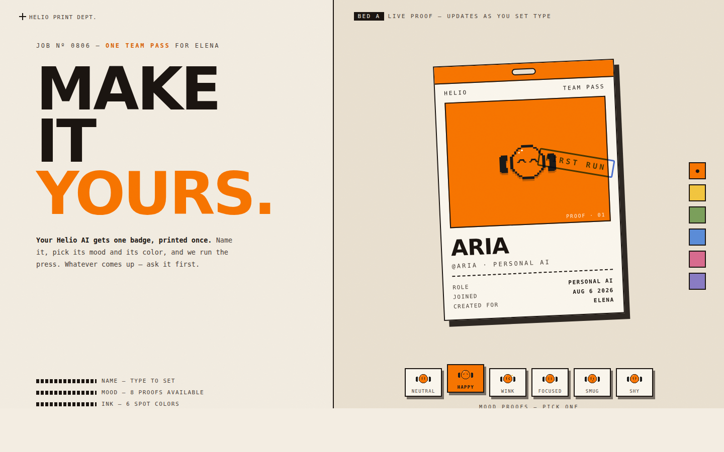
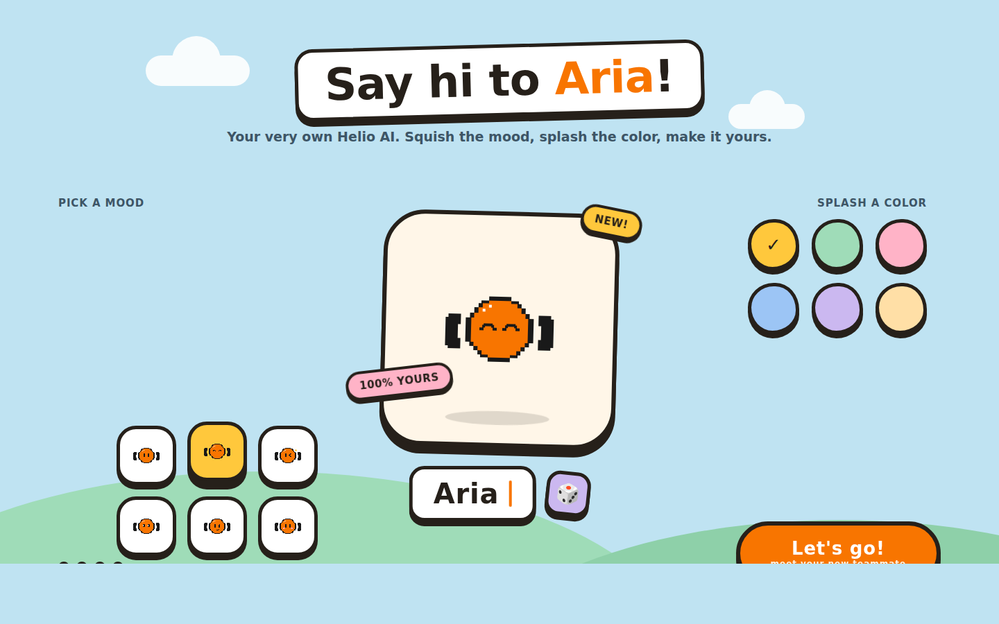
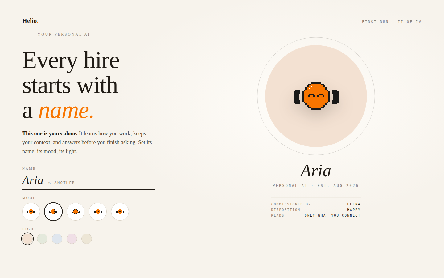
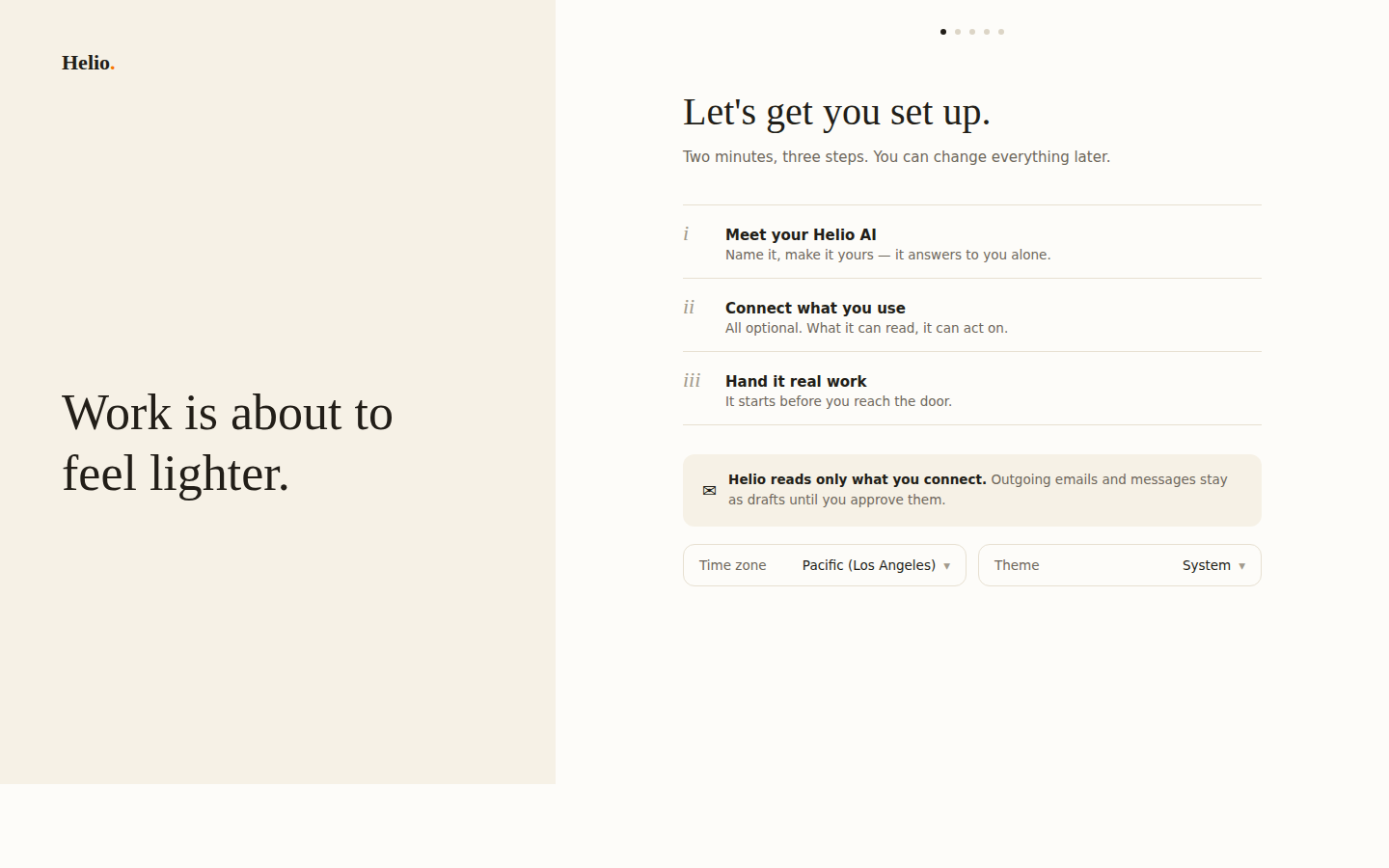
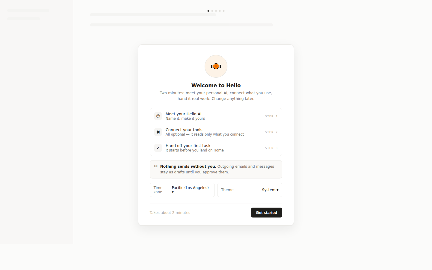
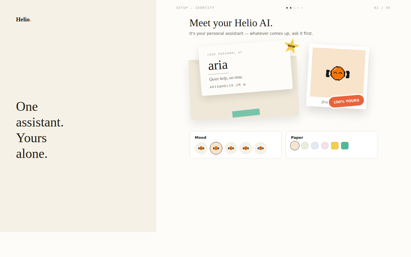
D won: warm editorial. Petrona for display, DM Sans for the interface, cream at #F6F1E6 against ink at #221E18.

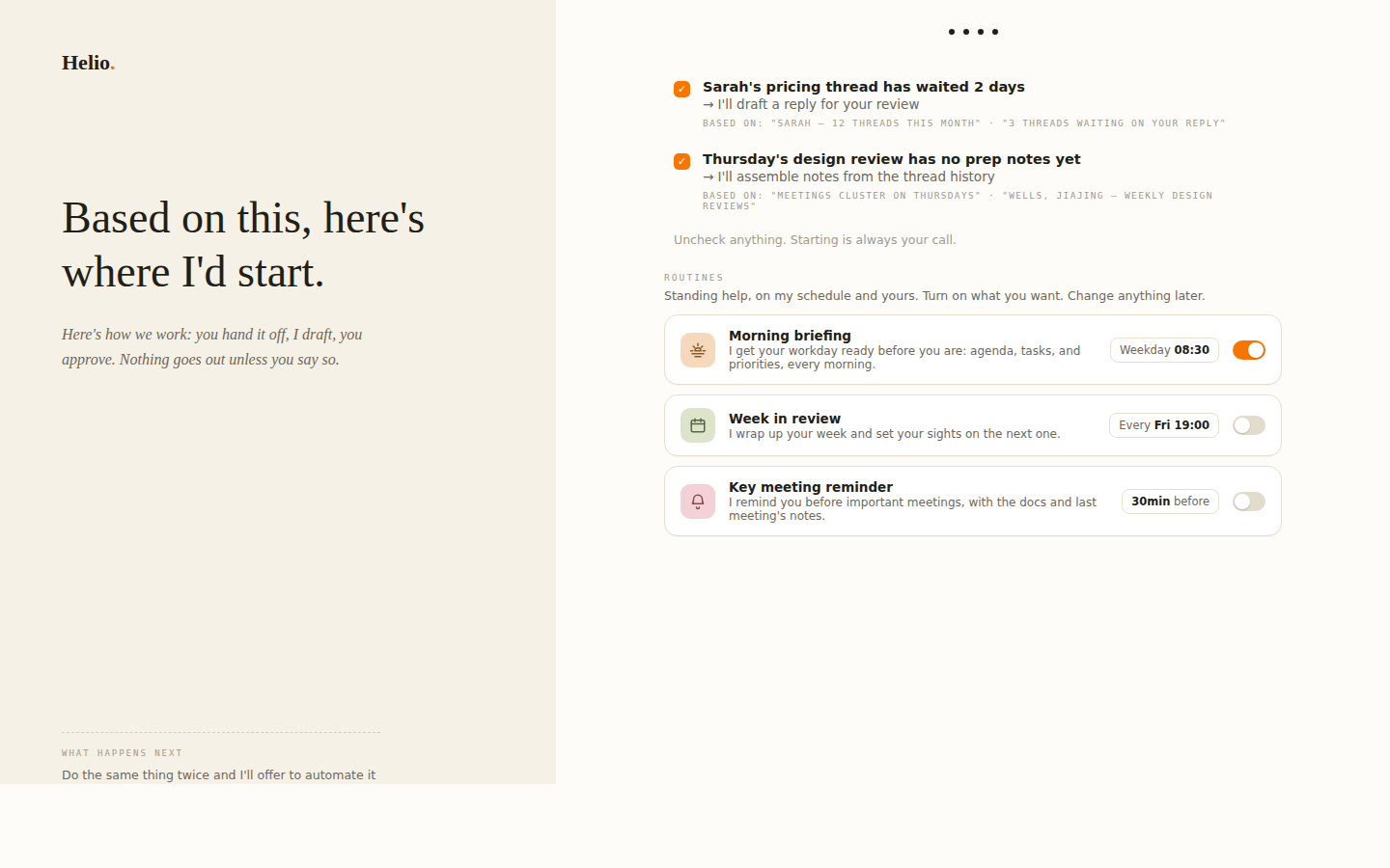
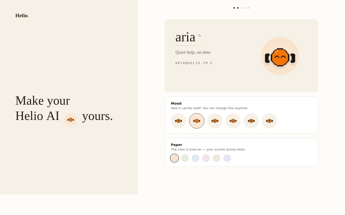
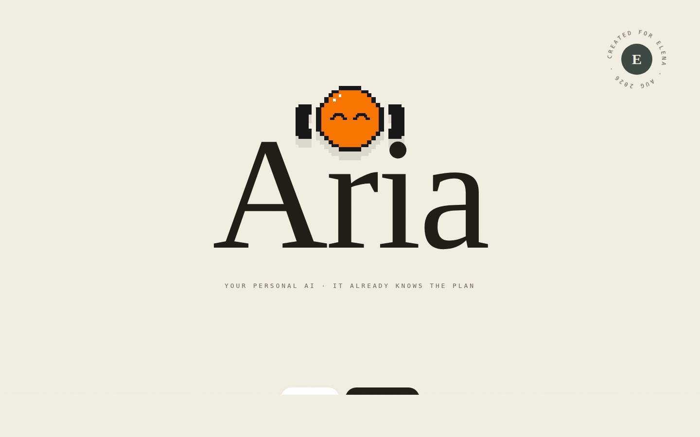
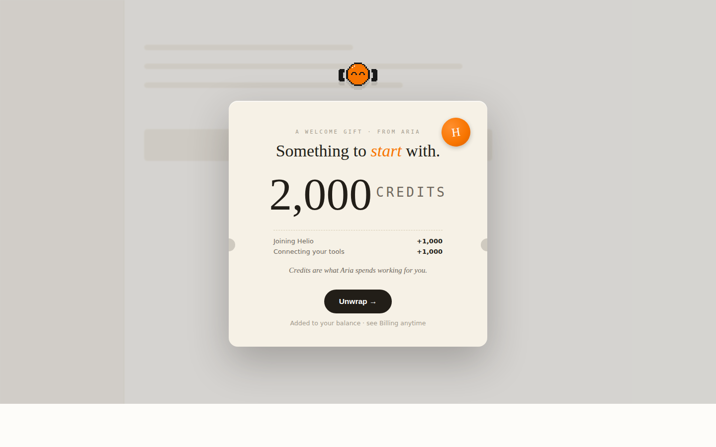
The winning direction, carried across every act before any of it was built for real.
How the last screen got there
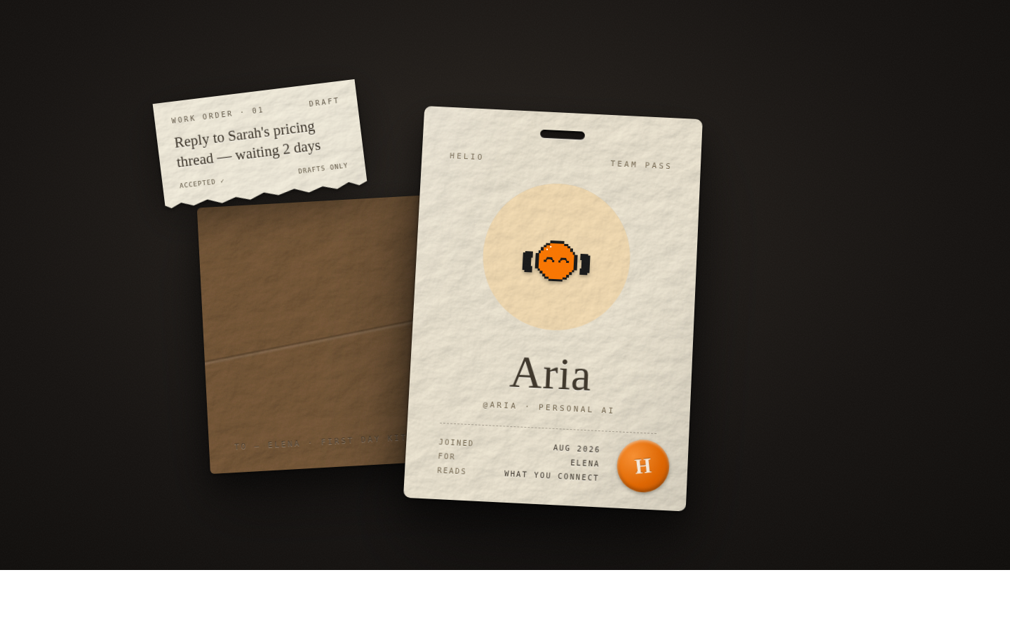
The last act did not start as a document. It started as a badge on a lanyard: the card hung from a woven strap, and you could drag it and let it swing back like a pendulum. Hand-rolled spring rather than WebGL, so the serif name and the pixel avatar stayed crisp.
Three days later it was a dossier instead, and the three takes below all landed inside one day.
The badge was a toy, and the only one in the whole sequence, which is what the dossier gave up. What it did not have was room. A card hanging off a strap holds a name and a picture, and the screen the flow actually had to end on also lists the work that was just handed off, which will not hang off a strap.
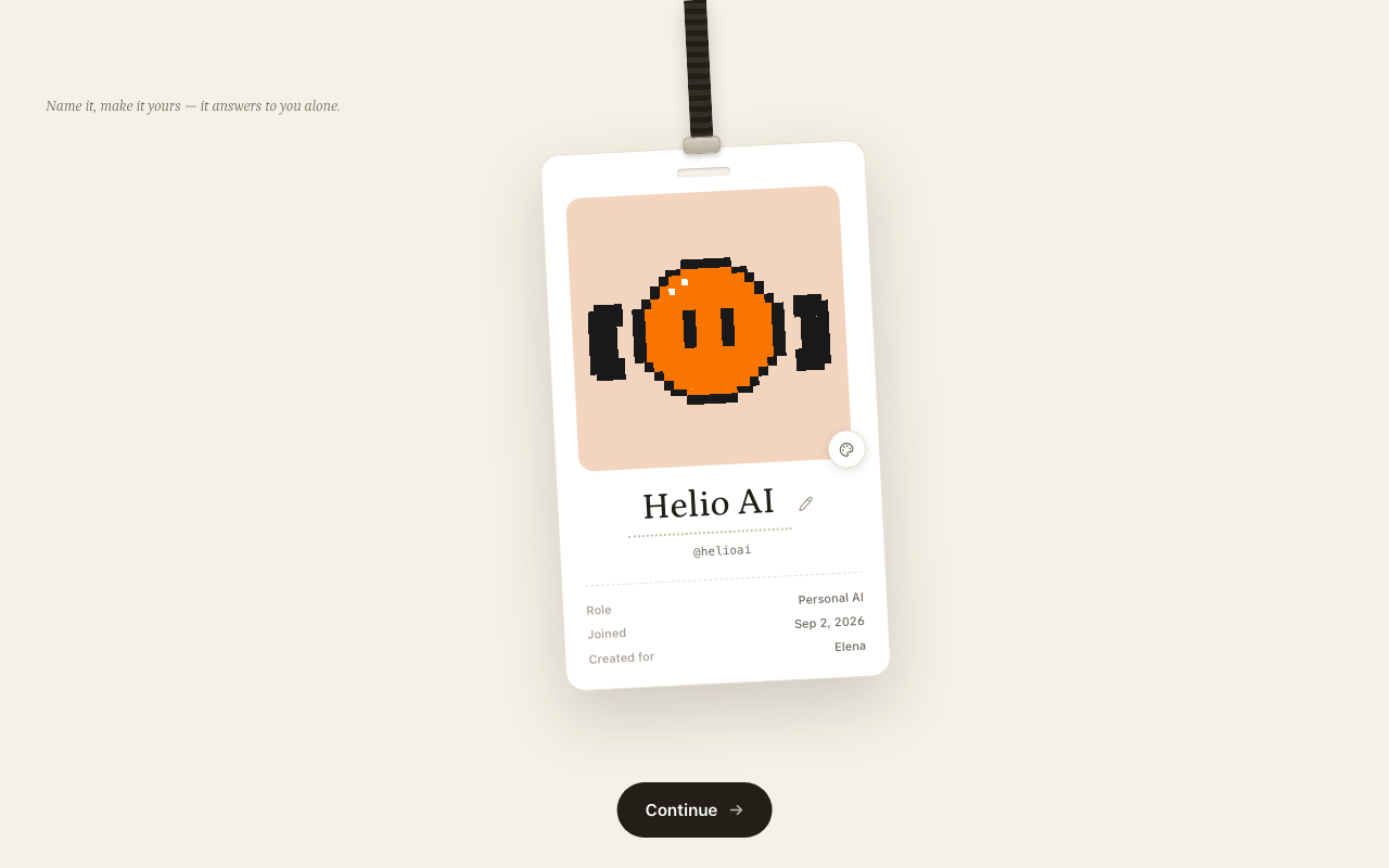
The last screen is the identity moment, and it is the one that took the most tries. It started as an employee badge on a lanyard. That became a dossier, and the dossier got built three ways instead of argued about.
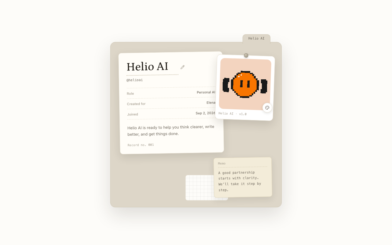
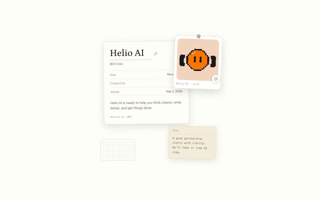
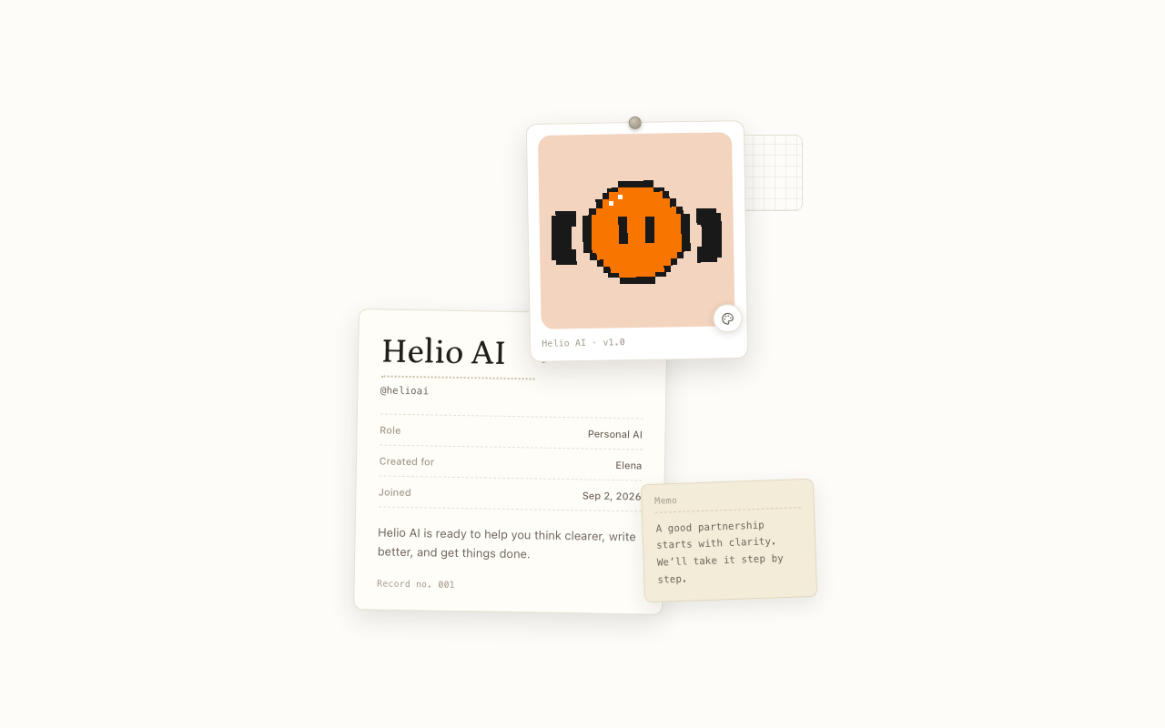
Three took a day. Number three won: two stacked papers, no outer folder, the avatar card as the hero.
What I built
The entire frontend: React, TypeScript, Tailwind, all state, the Dot animations, the scan visualisation. Nine locales in full. Profile generation and task suggestion were another engineer's.
PR #2602 landed as prototype plus shared components with no change to the production path, twenty-six CI checks passing. It never shipped, because the company closed first.
There was also no user testing. Every decision here is reasoned, none of it observed, and I would rather say that than imply otherwise.
What I would do differently
The visual system was designed to pull the whole product forward. That only pays off if the rest of the product moves with it, and under time pressure the other surfaces did not, which left onboarding looking like it belonged to a version of Helio that never arrived. I would either scope the ambition to what the product can absorb, or make the case for cross-surface alignment before committing.